Introduction
The new Leecare Dashboard enables a User to setup up to 8 different quality dashboard areas / reports that auto display results of Incidents – General and Medication, Wounds and infections, when opened, based on the criteria initially selected.
The displays can be set to include multiple months of existing quality statistics data for each selected criteria, comparing individual months' data on the same graph for the selected date range for an individual facility/business area. OR
The existing quality statistics data can be set to display for a selected date range, individual Facilities / Business Areas data on the same graph, to enable a comparison between sites’ quality data.
Permissions
This Dashboard can be accessed by all users with sufficient permissions to access the Reports module of Platinum 5. To access it, click the Dashboard Tab present in the Reports feature.
![]()
Details
To Create a Graph to always appear in one of the allowable 8 Dashboard sections upon opening this feature, the user selects the ‘Create a New Graph’ button and selects the relevant criteria for that section of the overall dashboard.
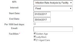
A common selection box appears from which selections are made. The date range boxes are greyed out if a set Interval period is selected. If a ‘Fixed’ interval is selected for a section, the Start Date and End Date boxes will no longer be greyed out.
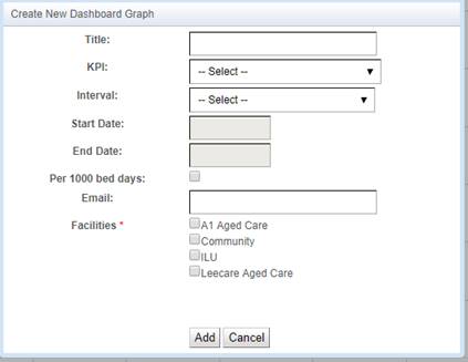
The user can also select if they wish the selected graph to display the data as per 1000 bed days, taking into consideration the occupancy details.
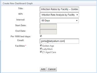
The user can type in their own Graph section Title – it is best to ensure the Title reflects the criteria selected for that graph so that open viewing, all criteria reflected on the graph are easily identified ie. ‘Infection Rates by Facility – Golden Age, Lady Allum, Z1 Aged Care – 60 days – per 1000 bed days’.
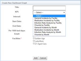
The KPI’s available to select from, for the purpose of setting up a Dashboard area, are those most commonly used in the Quality Statistics feature of Platinum 5 as shown below:
- General incidents by Facility
- Medication Incidents by Facility
- Infection Rate Analysis by facility
- Wounds by Facility
- General incidents by Month
- Medication Incidents by Month
- Infection Rate Analysis by Month
- Wounds by Month
The period of time the user wishes the graphs to display the selected data for, from either the day the dashboard is setup by the User OR from the start of each month, is selected from the Interval drop down.
For example, if a User wishes to view 60 days of the selected data each time they open the dashboard page, the user selects an interval of ’60 days’ and the feature will display 60 days’ of data from ‘todays date backwards’.
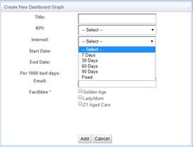
If a ‘Fixed’ date is selected ie. 1/3/17 – 30/4/17, the dashboard will display the selected data for that fixed period of time only.
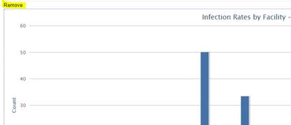
When the user wishes to select a different date range, they need to select to ‘remove’ the present dashboard section and setup a new one by selecting the Remove hyperlink on the dashboard screen directly above the selected dashboard section. ![]()
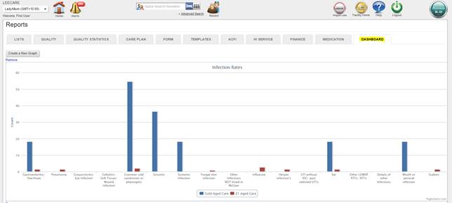
The following example displays the Title selected in the ‘Create New..’ setup box, the KPI data to be displayed on the graph, the Interval to display the data for, based on a per 1000 bed days calculation, for the three facilities selected, in the one Dashboard section. Details re emailing the reports will be provided in a later upgrade:

The KPI graphs generated by the Platinum 5 Dashboard reports feature, includes a hover tooltip feature, stating the content of that graph area i. e. the below graph tooltip indicates that the line selected represents 50 reports of Common cold recorded per 1000 bed days for the Golden Age facility for the 60 day period the graph represents.

Showing each months’ data for a selected KPI set of criteria in a single facility
If a user wishes the dashboard section to display each months’ data for each issue Type, for a selected period ie. 90 days, as separate month’s data to compare against each selected month, they would select the below criteria as an example.
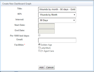
The user selects the KPI to display ‘by Month’.
They select the Interval as 90 days.
If the last 90 days included February, March and April, all quality data results for Feb, Mar and Apr will display. If January data existed within the 90 days for the last few days of January, the graph would then display those relevant January details also for each issue type related to that KPI.
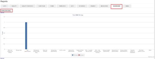
The data will display as per the below screenshot. February’s data columns display in green in this example, and show the number of times issues of certain types occurred in February, March’s data columns are blue with April’s red columns displaying next.
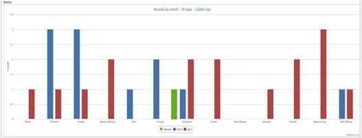
As noted above, if the user selected an ‘Interval’ named ‘Fixed’, the KPI data for the selected KPI for the selected date range as per the Start and End dates would display, separated into months.
Please note: the number of events for each KPI issue type during the selected periods, whether selected for a set number of days eg. 90 days’, or for a fixed period, will be displayed on the graph as a numeric number and the Vertical AXIS will adjust to the largest amount of Issues’ types for the months’ data being displayed ie. if the largest number of issue types is 20 in any month for any issue type, the vertical axis will be ‘20 issues’ high.
![]()
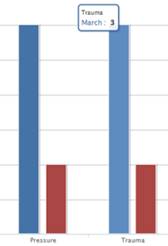
Each month will display as a different colour and will only display as a column for a criteria where KPI data exists for that month. The graph KEY will still display in the lower part of the graph area and indicate which month is which colour.
And as expected, a tooltip will display when the user hovers their mouse over a column. The tooltip will indicate which type of KPI is represented by the column and the Month and numeric amount of that KPI type.
Note: If a user selects to display each months’ data for multiple facilities in this Dashboard section, the column will display the number of individual criteria for the months’ within the date range selected, added across all the sites ie. a ‘cumulative facilities’ total will display for each month instead eg. if a user selected this section to display the total Wound criteria for the months of February, March and April for the three facilities, the graph total for the month of March for wounds caused by for example ‘Pressure’, will be the total amounts of wounds caused by ‘Pressure’, reported by Golden Age, Lady Allum and Z1 Aged care in March.
And the same logic applies to February and April.
Displaying a selected date range’s data for multiple facilities
A facility comparison report can be generated for any of the KPI’s in the KPI drop down selections, for a selected period of time or a ‘Fixed’ interval / date range. All selections as noted above apply except this graph does not display a single facilities data for each month, in separate columns for each issue type, BUT shall display:
- the amounts of each Issue type for the selected period of time or date range for each facility
- compared with the next facilities collated amounts for each issue type and the next facility for the selected time period
- on the same lower axis so you can see eg. data for each wound type for facility 1, 2 and 3 for the selected period
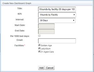
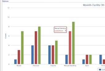

Showing data for a selected KPI set of criteria whilst also selecting the Per 1000 bed days checkbox
When a user selects the ‘Per 1000 bed days’ option, the report/graphs will display each of the Issue Types’ monthly amount, using the below formula:
o If the month by month comparison report is selected - For each issue type for each month in the selected date range: No. Issue Types occurring in the selected number of days in the selected month / total number of beds occupied in the facility each day in that month X 1000
OR
o If the Facility comparison report is selected - For each issue type for each facility for the selected date range: No. Issue Types occurring in the selected number of days in the selected facility / total number of beds occupied in the facility each day in that selected date range X 1000
As an example, if a user wishes to identify the issue type ‘found on floor’ rate for the 30 days prior to generating the graph in a 100 bed Facility, Per 1000 bed days, the rates are calculated as follows:
1. the number of ‘found on floor’ incidents during the month are obtained from the incident reporting system – in this example we will say there were 90 ‘found on floor incidents’ over the 30 days
2. then, the system will calculate, how many beds were occupied in the facility each day e. g. 96 beds on the 1st, 99 beds on the 2nd, 98 on the 3rd and so on, from the Bed Day List
3. the system will then add up the total occupied beds for each day of the month, for example 2,910 days (out of a maximum of 3,000 if all 100 beds were occupied on all 30 days, 100 x 30 = 3,000).
4. the dashboard then divides the number of ‘found on floor’ episodes by occupied bed days for the month, which is 90/2910 = 0.0309, then multiplies the result by 1,000
5. 0.0309 x 1,000 = 30.9 – your ‘Found on floor’ rate per 1,000 occupied bed days will display
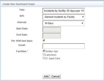
To generate a Dashboard section for the above scenario where you wished to view the ‘Per 1000 bed days’ statistic, for the Incidents by facility for 30 days, where Golden Age facility was 100 beds, you would select these settings.
The below graph will then be automatically generated and display. The hover over feature will give precise numbers.
If you selected more than one facility, to compare the results across the facilities, the graph will display the multiple details in one view.
